The design of your Form helps customers understand and complete it more easily. For long Forms, breaking it into logical sections and pages improves clarity. Labels and rich text formatting guide customers and highlight key information.
This article explains how to use the various design elements of a Form.
.PNG)
Three-page Form with collapsible sections shown on a customer mobile device
Pages
A page in a Form is presented as a new screen in the customer interface. The customer can scroll to different sections on the same page and click a button to advance to the next page. See illustration above.
This section explains all the settings related to Form pages.
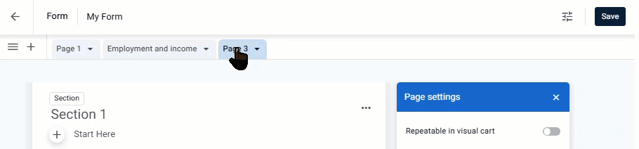
Adding, deleting, and organizing pages
In the Form builder, pages are organized in tabs and can be easily added, deleted and organized.
Add page - click the + button in the page toolbar.
.png)
Delete page - click the arrow next to the page name, and click Delete.
.png)
Rename page - click the arrow next to the page name, click Rename, and type the new name.
.png)
Change page order - click the page and drag it to the desired location.
Hide page numbers
By default, each Form page displays a page number in the top right corner in the following format: Page # / Total pages. However, depending on your Form’s design, you may prefer to hide this element.
.png)
Form showing page #1 of 3
To hide page numbers in a Form:
Click the page formatting icon and turn off the Display page numbers toggle.
.png)
Show or hide pages based on conditions
You can set visibility conditions to determine when the page will be visible to the customer based on certain conditions. For example, you can set a page to be visible only to people who live in California (based on the value they entered for State).
To set visibility on a page:
Click the settings button. The page settings pane opens:
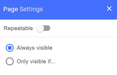
Click Only visible if, and in the dialog box that opens, set the visibility conditions based on the relevant Attributes.
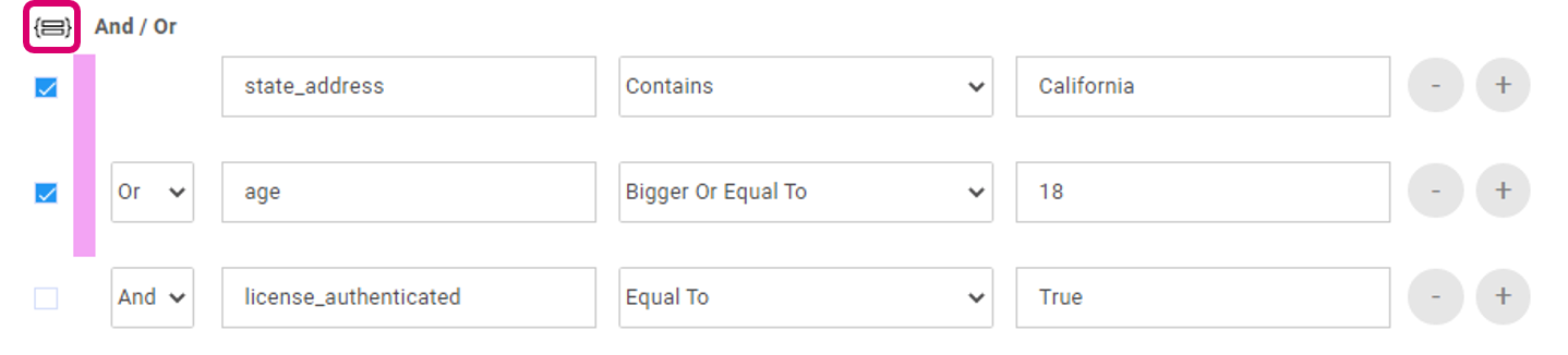
You can combine multiple condition statements using And / Or logical operators. You can also create more complex conditions by including some condition statements in parentheses. For more information about working with conditions, see Setting conditions in Workflows.
Customize the Next button
By default, the customer clicks Next to advance to the next page of the Form. You may need to change the text of the Next button to match your branding or Form design. In addition, a more specific word may sometimes help your customer understand what is coming next.
.png)
Form page showing Next button
To customize the Next button:
Click the tab of the page for which you will change the button.
The page is selected.In the Page settings panel, click Customize button label and type your text.
.png)
Sections
You can organize a page on your Form into different sections each with its own title. Sections can make a Form more readable for your customer. Use the collapsible section feature to enable customers to more easily view longer Forms.
Add and configure sections
Add section - click the + button and select Section.
.png)
Rename a section - select the current section name, and edit it.
.png)
Make the section title visible for the customer - in the Section settings panel, click Show section title.
Note
When the section title is hidden the customer does not see any break between sections in the final Form.
Enable the customer to collapse and expand a section - select Make selection collapsible.
.png)
Customer view
.PNG)
“Contact information” section collapsed and expanded on a mobile device
Section visibility
You can set visibility conditions on a section to determine when the section will be visible to the customer based on certain conditions. For example, you can set a section to be visible only to people above the age of 18 (based on the value they entered for Age).
To set section visibility:
Click the section so that the Section Settings appear in the Settings pane.
.png)
Click Only visible if, and in the dialog box that opens, set the visibility conditions based on the relevant Attributes.
You can combine multiple condition statements using And / Or logical operators. You can also create more complex conditions by including some condition statements in parentheses. For more information about working with conditions, see Setting conditions in Workflows.
.png)
To edit the condition, click Edit visibility condition.
.png)
Make a section repeatable
When you create a visual cart, you can set a section to be repeatable. This means that the agent can re-use the section of the Form multiple times in the the same journey. For more information, see Create a visual cart.
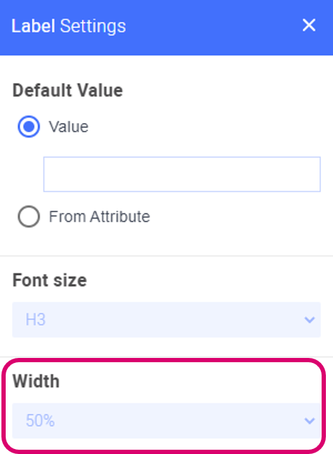
Labels
Labels are lines of text that can be used as titles and can add more organization and clarity to the Form. Unlike rich text elements, labels can be placed side-by-side with other Form fields. However, label text cannot be formatted.
To add a label:
Click the + button and select Label.
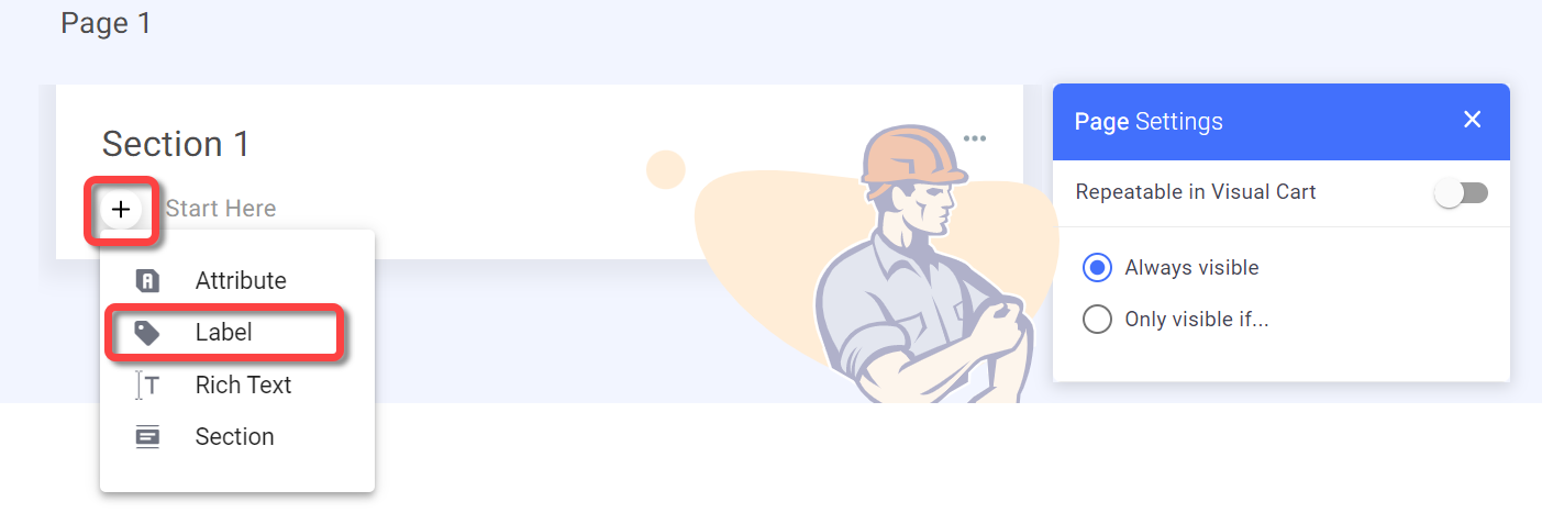
A new label is added and the Label settings pane opens on the right.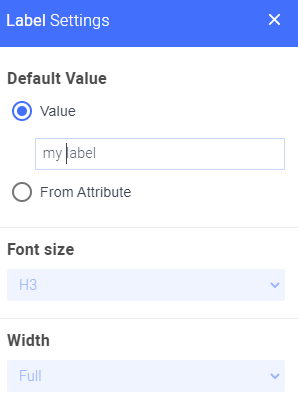
You can enter the name of the label or base the label value on an Attribute.
To enter the value of the label, select Value and type the name of the label
To base the label value on an Attribute, select From Attribute and select the relevant Attribute
Select the font size from the Font size list.
If you drag this field next to another field in your Form, you can define the relative width in the Width list.
Rich text
Enhance the design and readability of your Form by adding a section of formatted text. You can enter static text or an Attribute that will update in the Form as soon as the Attribute value is provided in the session.
All text, including Attributes can be formatted. You can also include a hyperlink and embed a video into the Form.

To add formatted text to your Form:
Click the + button and select Rich Text.

The text editor appears.Enter and format your text.

To insert an Attribute, place the cursor and click the Attribute button

-OR-
type @.
The Attribute picker appears.
Select the required Attribute.
The Attribute appears.
Select the Attribute to format it.
Layout
You can arrange the different elements in the Form by dragging them to the relevant location in the Form.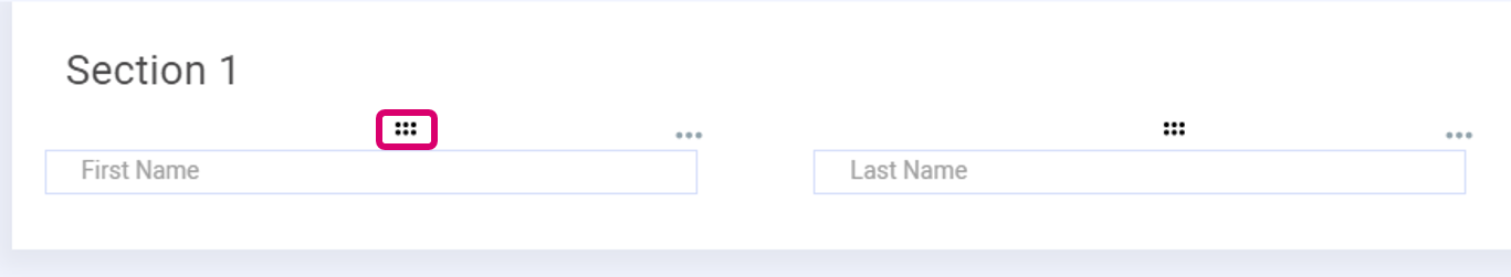
Most elements can be arranged side by side in the same row, except for dropdown fields, checkbox fields and formatted text. You can place up to a maximum of 3 elements per row.
In the element settings you can set the relative width of each element in the Width box.