The article gives basic instructions about how to create a digital Form. More advanced features of Forms are covered in subsequent articles in this section.
How to create a Form
Note
Forms can be added to a collaboration session only as part of a Workflow.
Tip
You can create a new Form when you add the Form item to a Workflow. See Create Workflows.
The instructions below show how to create a new Form from the Forms page.
To create a new Form:
In the Admin Center navigation pane under Journey, click Forms.
The Forms page opens, showing all saved Forms.In the top right corner of the Forms page, click Create new.
In the New Form name dialog, type a name for the Form and click Create.
The Form builder opens.Add Attribute fields to the Form - see below.
Design and format the Form - see Design the Form.
Click Save.
Add Attribute fields to the Form
You can add the following types of fields to a Form:
Text - Enter free text
Number - Enter a number
Checkbox - Select one or more options
Dropdown - Select one option from a dropdown list
Radio button - Select one of the button options
Boolean - Select true or false
Date - Select a date from a calendar
Address - Enter an address (only available when you are integrated with an address verification service, see Address Auto-Complete and Validation)
Complex - Groups multiple Attributes under one parent Attribute, acting as a label for the grouped Attributes in the Form. Enhances organization and clarity in data entry.
List - Holds multiple values for the same Attribute
To add Attribute fields to a Form:
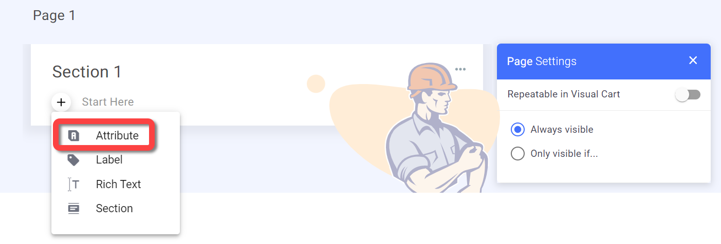
Click the + button in the relevant section and select Attribute.
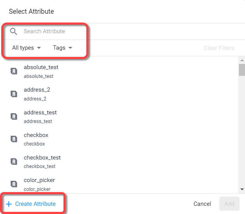
The Select Attribute dialog appears.Search an existing Attribute or create a new one (see Create and edit Attributes in Form builder), then click Add.
The field is added to the Form.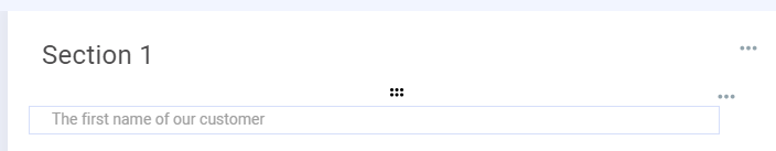
Configure the fields settings.
When you select a field, the settings for that field are displayed in the settings pane on the right.
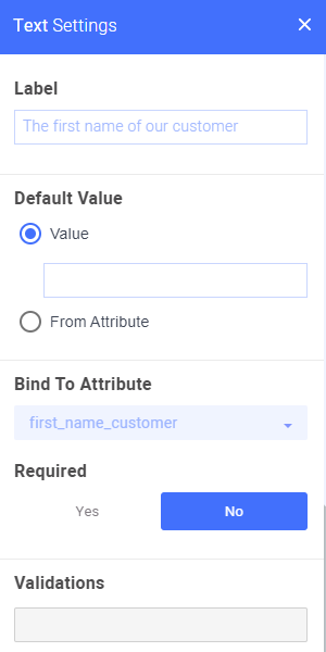
For a description of each of the field settings and how to configure them, see Configure Form Field settings.Click Save to update the Form.
Add nested fields
When you add a checkbox or radio button field to your Form, you have the option to add nested fields to each of the options.
For example, you can create a radio button Attribute with options as follows:
Married
Single
Then under the Married option you can nest a number field that asks how many dependents the customer has.
.png)
Note
The following types of Attributes are not supported for nested fields:
List Attributes
Complex Attributes
To add a nested field:
Click the + button under the relevant checkbox or radio button option and add/create the desired Attribute field. .png)
Display all nested fields
It may be helpful to your customer’s understanding of the options if they can see the nested fields for each option.
By default, nested fields are NOT displayed in the customer Form until the main option is selected.
To display all nested fields upon opening the Form:
Select the relevant radio button or checkbox field.
In the settings panel, turn on the Show nested items toggle.
.png)
.png)